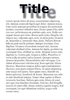
Before this exercise, we had to look at making new files in photoshop, something I am familiar with from book making projects. We had to add text and a heading, and move it around to see what effect it had with the text in different places. Then we had to add a drop shadow to the heading to see what that looked like. This was quite a challenge as it involved duplicating layers which for some reason was not as easy as it sounds! I had to look up how to rasterize the layer as it was not as simple as it looks in the instructions. It was an interesting exercise, but I am not sure photoshop is the best programme for this if adding text as there are limitations.

No comments:
Post a Comment